Lusideias ATM
October 20, 2015
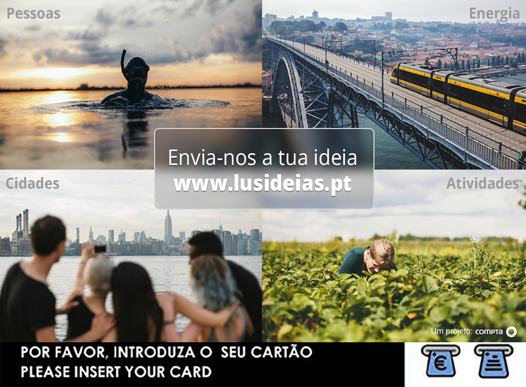
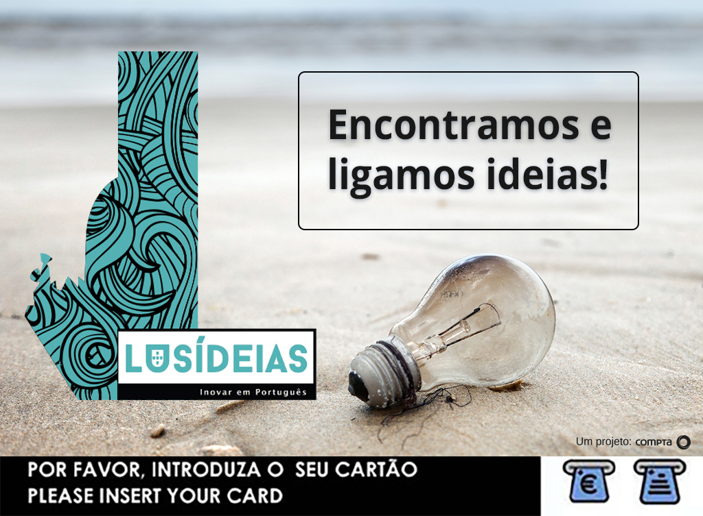
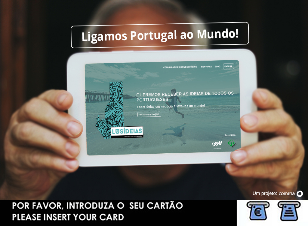
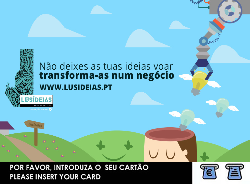
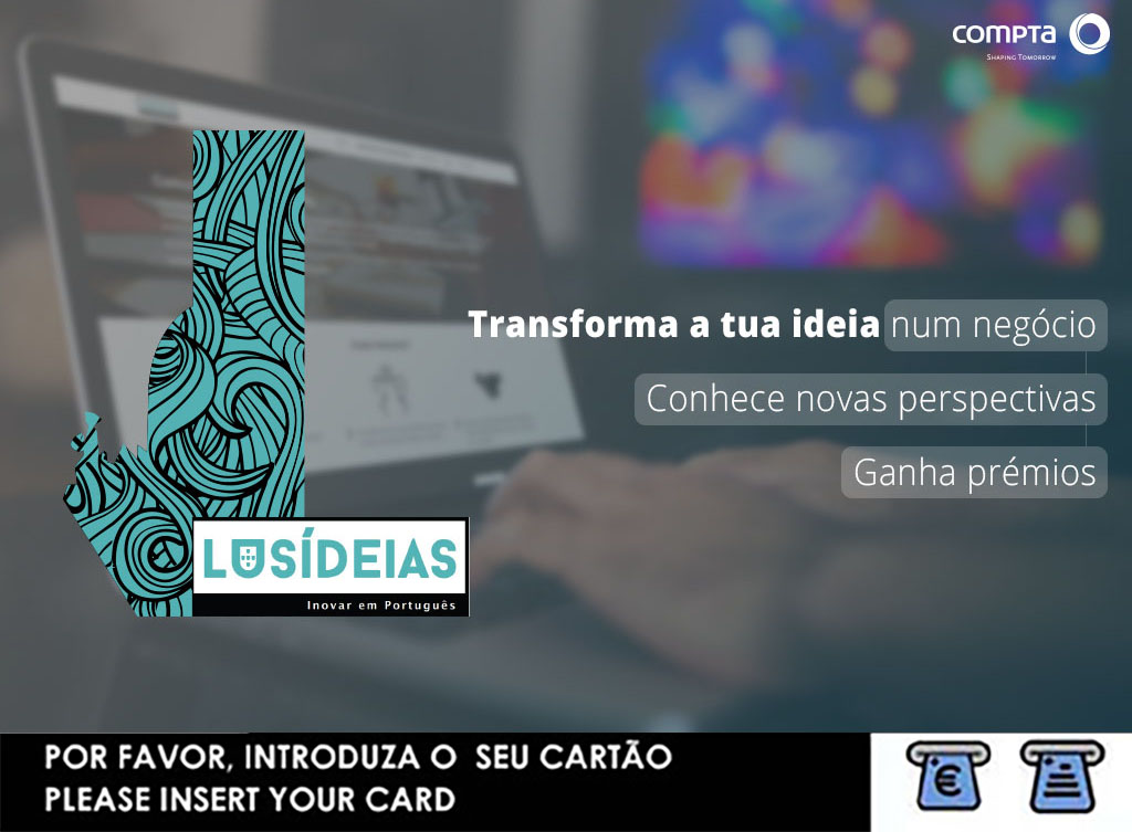
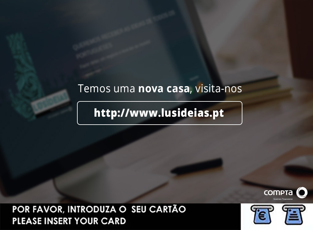
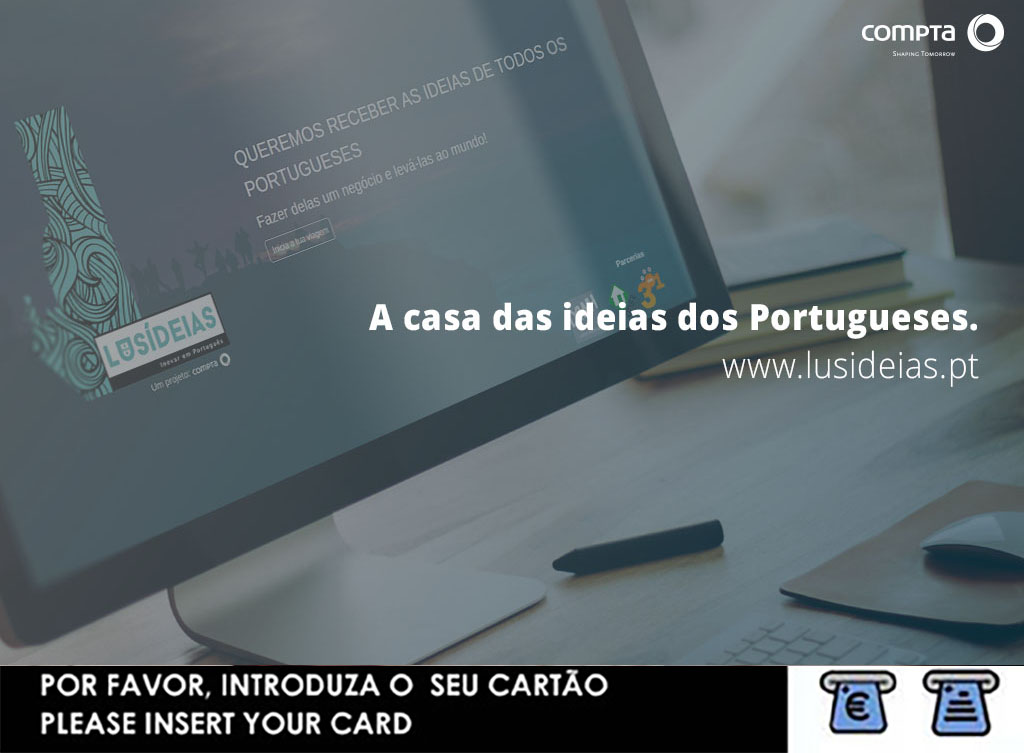
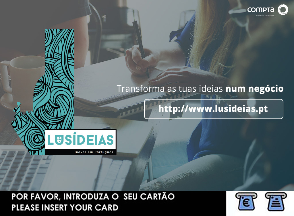
A new campaign to show that Lusideias had been re-designed and is now more usefull, and easier to use.
First of all, the brief was nothing more than a hand full of words that didn’t had a defined objective neither there was any definition of what the target audience would be. Also no budget at all.
So I started sketching some ideas
-
- A more illustrative aproach
-
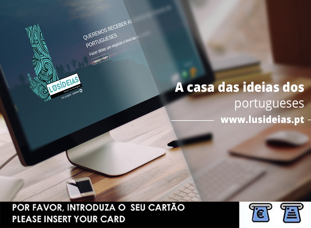
- Informative with a PC reference
-
- Straight to the point, get to know our new website
The illustrative approach was promptly putted aside due to being “childish”, the other two because they had too much information.
So I made some new with less information and more sober.
-
- With reference to the new homepage
-
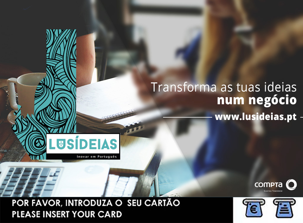
- Co-working and collaboration reference
-
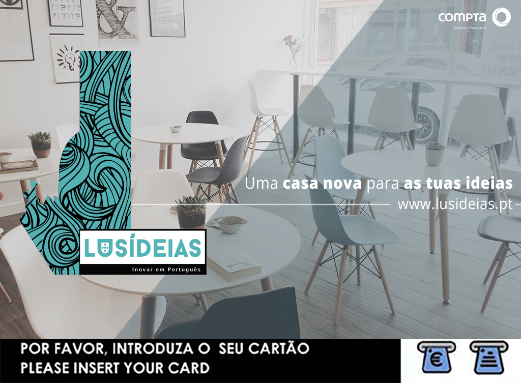
- A more tidy “home” for your ideas
The feedback received was that the background was too dark and a lack of color overall wich I agreed and then made the following proposal.
-
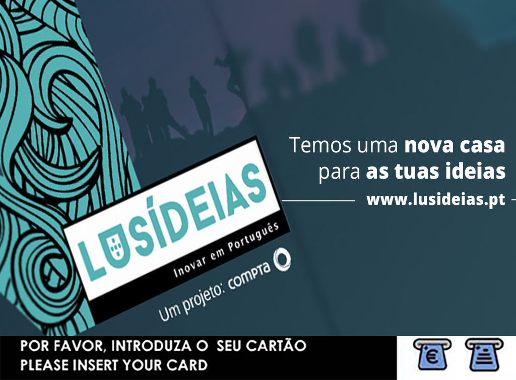
- Proposal 1
-
- Proposal 2
-
- Proposal 3
Well short story, the above proposal wasn’t accepted and was really dificult to get some good feedback or direction to work. Suddendly a projet that didn’t had budget, had a budget and I received a PDF with clear instructions to do the following compositions. And it’s the campaing that got approved.